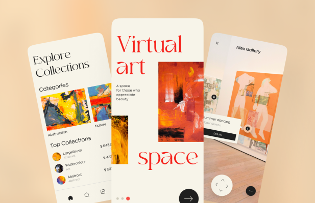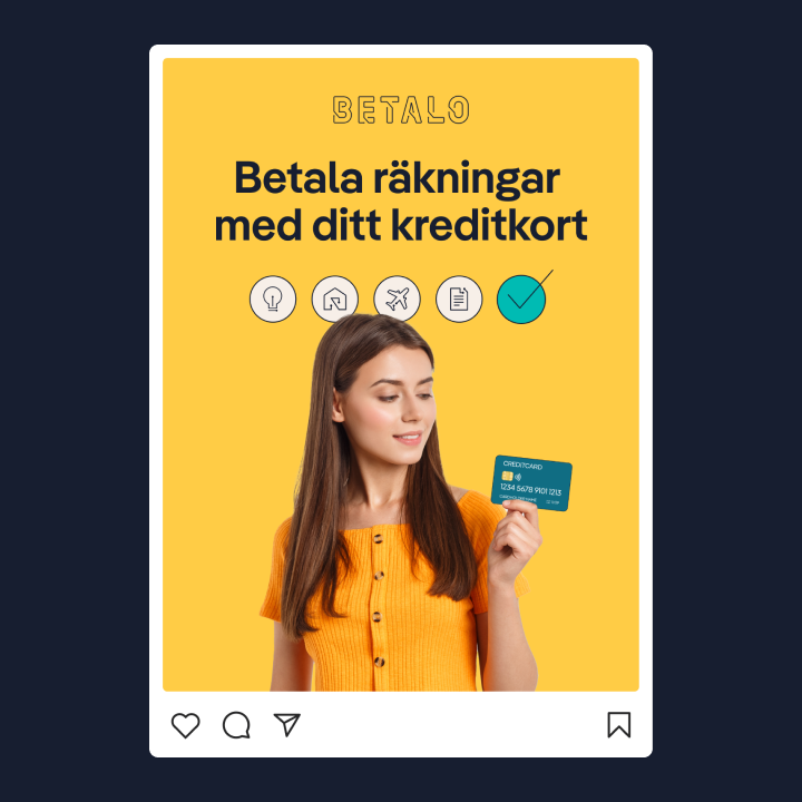
A visual identity comes in many different forms, not just from a graphical perspective but also in structure and content. The visual identity exists to shape and concretize a brand platform. Therefore, it must contain what is needed to produce a graphic design that follows an established design language in all communication. Changing a visual identity is often an extensive and expensive project. So it is good to spend some time getting it right from the start.
Often, we come across companies that state they have a visual identity but lack content, which contradicts the fundamental idea of having a visual identity. Below we list what you, as a customer requiring a visual identity, should request in connection with making this brand investment.
Logo
A visual identity must contain all the information about your logo needed to produce a graphic design based on it. Also, it includes a version of your logo and the composition of words, images, colors, format, and how the logo can and cannot be used. The logo should always be delivered in the following formats:
- EPS (vector format for illustrations)
- SVG (web-friendly vector format)
- PNG/JPEG (digital formats)
Primary colors and accent colors
The number of colors used may vary from one visual identity to another. However, a rule of thumb is always to have at least two primary colors representing the brand. It is good to utilize accents and secondary colors to complement this. These should be described both visually and in the following color codes:
- HEX/RGB/HSL (digital formats translated from each other)
- CMYK (used for print formats)
- PMS / Pantone (for correct color reproduction in all other contexts)
Typography
Fonts are another basic deliverable in any visual identity. Having more than one typeface is preferable to create a dynamic balance in the visual expression. If you have more than one, for consistency, it is vital to set up rules for when and how the different fonts are used. Fonts are typically described graphically in the presentation and delivered in, for example, OTF format. Note that many fonts must be “purchased” to be used for commercial purposes, which entails an additional cost.
Graphic elements (e.g. patterns)
Graphic elements such as a self-designed pattern do a lot to strengthen brand recognition and create many more opportunities for the person who will use the visual profile. Ask the designer to apply these graphic elements in different contexts to see how they are embodied concretely and ensure they work well in multiple channels.
Image style
In creating a visual identity, you should also review the visual expression in the images. The designer must translate the brand into the type of images the company wants to be associated with, for example, happy people at work or iconic buildings in an urban environment. An image style can inspire your photo shoots or be images that your company buys separately for an extra cost.

Illustrations and icons
A style for icons and illustrations is becoming an increasingly important part of any brand as the world becomes more digitized. Creating a complete icon and illustration library rarely fits within a branding project, but developing a style for how these should look provides better conditions for future development.
Implementation (examples of channel design)
Equally important as the components above are examples of their application in different channels. Showing examples gives future designers and content creators guidelines for how the elements are intended to be used and should interact. It also clarifies how to implement the visual identity in different channels and formats to maintain uniformity.
Do’s and don’ts
Describing how the visual identity is intended to be used—and should not be used—creates an essential guide for all future executives. Above all, this applies to the logo, which will appear in many different contexts outside the company’s control. This description is usually presented in a do’s & don’ts section. It is also a vital part of the training in implementing the brand in your organization.
Packaging and delivery
Traditionally, the visual identity is delivered as a PDF file, but we at Klingit advocate that it be packaged digitally instead. This makes it both easier to maintain and to keep alive, giving a more modern impression of the brand itself. At Klingit, we can create a website for your visual identity, one where all the components can be collected and packaged.
Here you can see how we did this for our brand: https://creative.klingit.com/
It is also crucial that, in connection with the delivery of the composite profile, you receive all components delivered in the correct file format. It makes sense to invest in a dedicated digital asset management system (DAM) to collect and manage your visual identity. Klingit provides a modern DAM for all our customers that is easy to keep up to date and share with colleagues and external parties.


